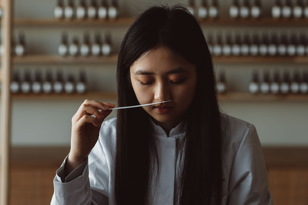
When the people from Delùsh Fragrances approached us back in 2021, they already built up a renowned reputation in creating luxury interior fragrances for the likes of Sergio Herman, Marcel Wanders, Hotel de l’Europe and Hotel August to name a few. They needed help to evolve from a qualitative interior perfume company into the source of the spatial perfume business, known and loved by a leading international clientèle.
Creators of invisible luxury
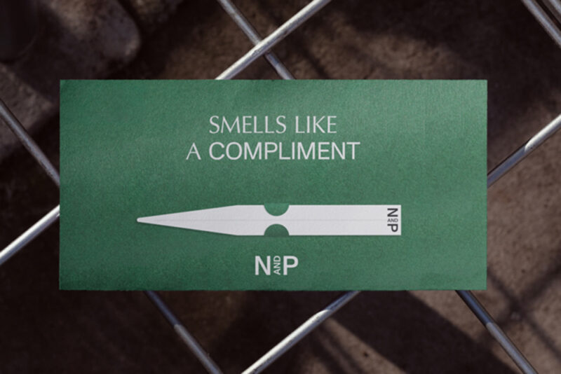
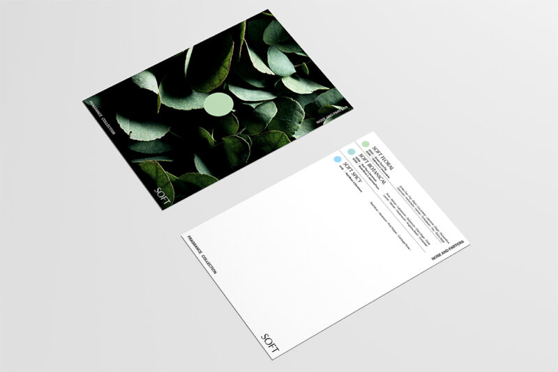
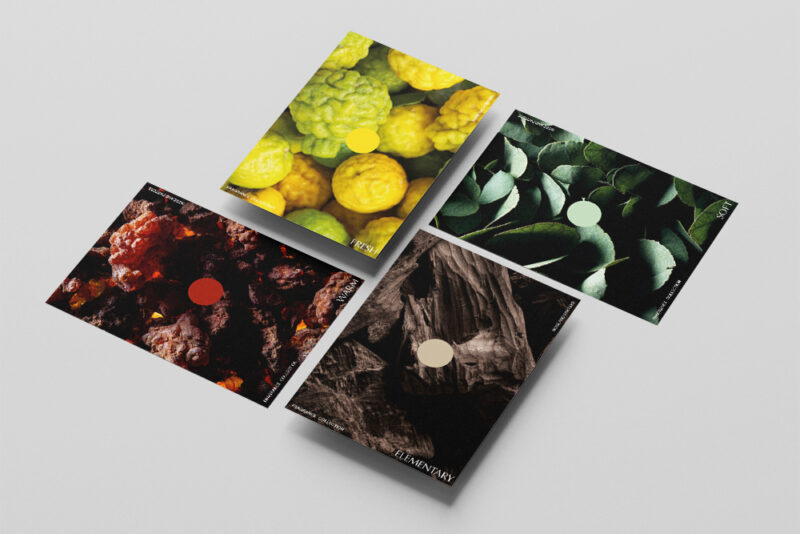
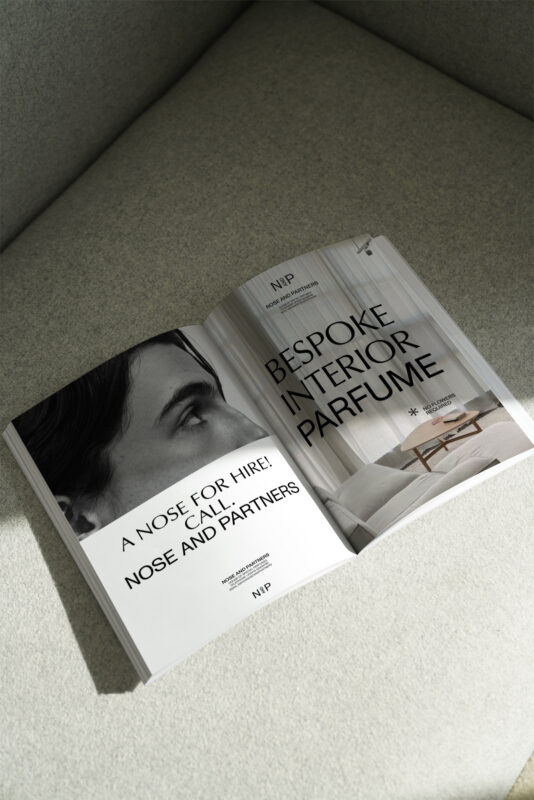
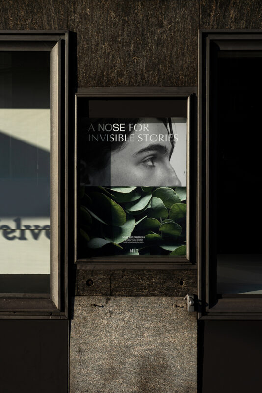
A branding project for an invisible luxury brand is a very interesting playing field. The perfume business in particular is pretty elusive. It’s an overwhelming universe where brands sprinkle the most exquisite promises. Sadly, a lot of them vanish in front of you. We aimed this rebrand to be straightforward yet intelligent, one that underlines authority without being too stiff and losing playfulness. Creating a chameleon brand that lets others shine, but when it takes the stage, it sparkles.
From our Nose to yours
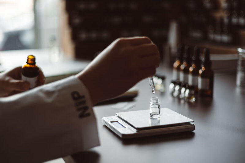
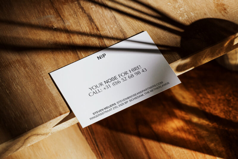
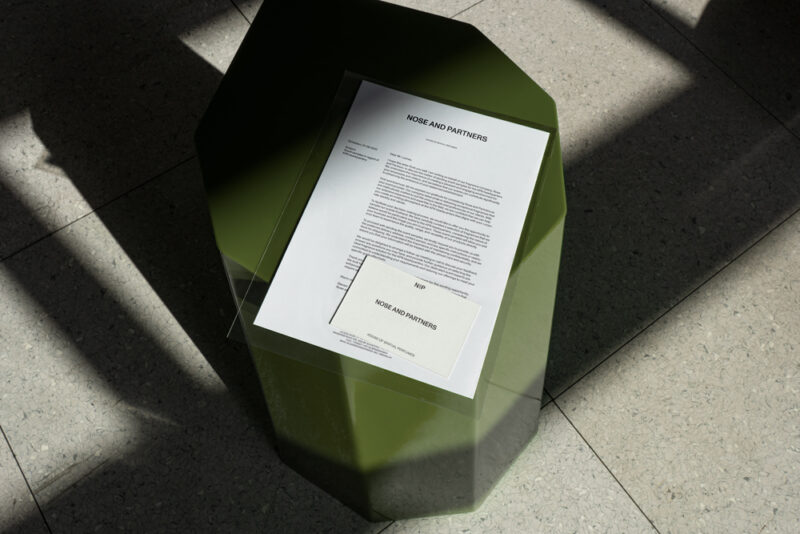
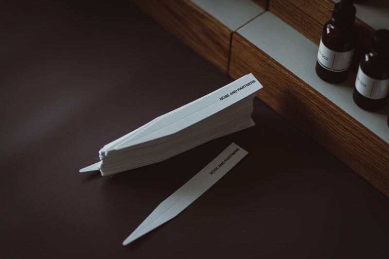
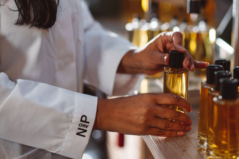
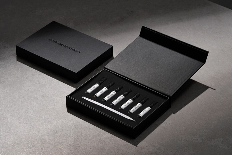
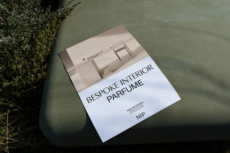
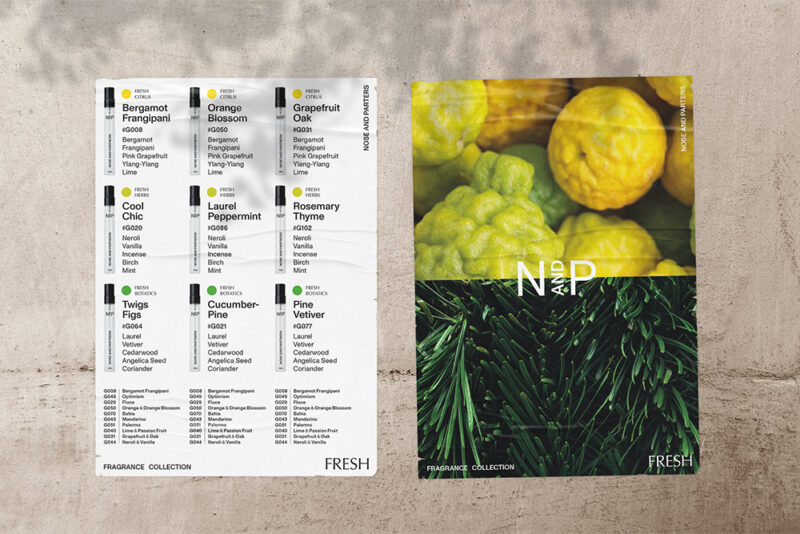
Nose and Partners was the name and identity that stemmed from our positioning of a House of Spatial Perfumes creating refined and invisible luxury for iconic places in the world. We then reshaped the company’s complete touchpoint experience and drafted a new brand architecture model which allowed more entrepreneurial partnerships to happen and ensure a trajectory that will take it global. The Nose and Partners identity is based on tactility without the fuzz. Charmingly straightforward and one that plays around with augmented reality and the realm of invisible luxury. Above all this, Nose and Partners now is a company that is a trusted partner for the world’s leading hotels, restaurants, retail and interior designers.