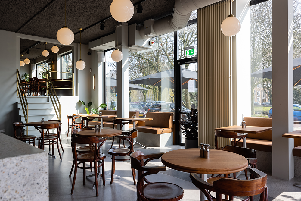
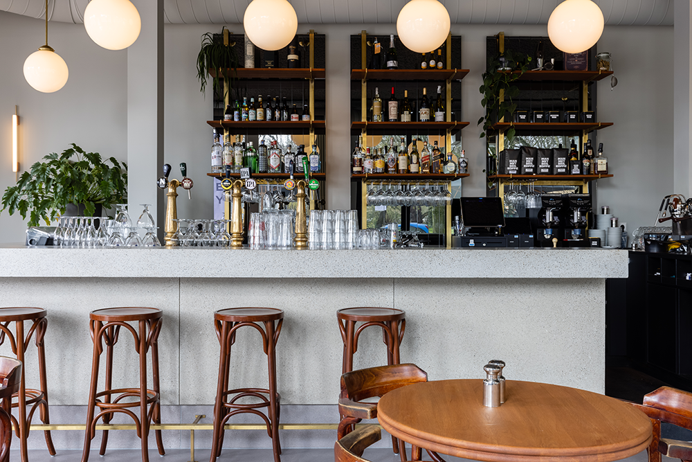
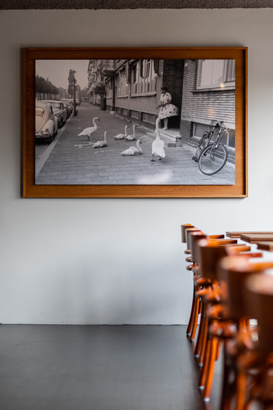
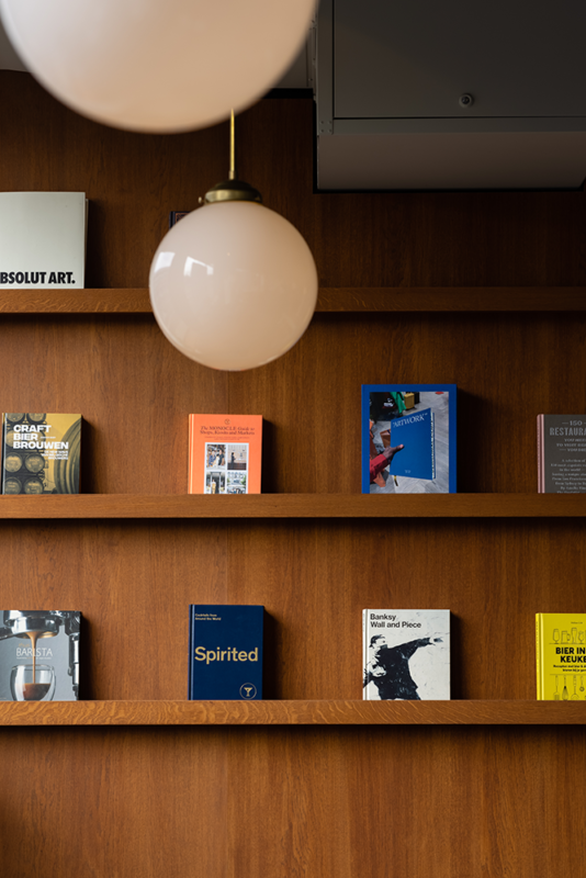
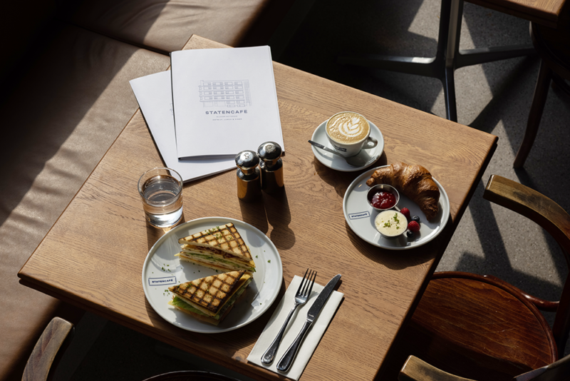
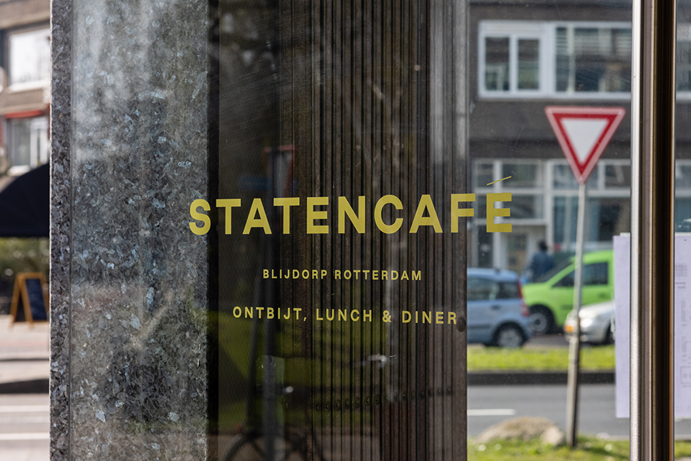
Statencafé is a home away from home. A small library in the corner, a cosy backroom up the stairs, a sunny south facing terrace and a proper bar fitting a café as grand as this. A familiar place where you’d like to sit down with a newspaper and a cup of coffee and watch the day go by. As Statencafé has put together a menu serving all time classics for breakfast, lunch and dinner it has become a refuge to people from the neighbourhood at any time of day.
Inspired by the envisioned grandeur
The grandeur envisioned by renowned architect Jo van den Broek, is still there today. As it was not affected by the 1940 bombing the building on the Statenweg stands proudly and acts like a gateway to neighbourhood Blijdorp. Statencafé sitting right on the corner celebrates this piece of 1930’s architecture.
Devil is in the details
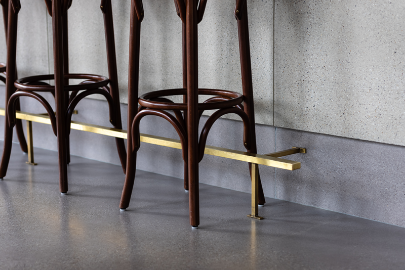
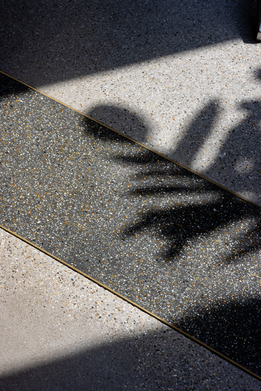
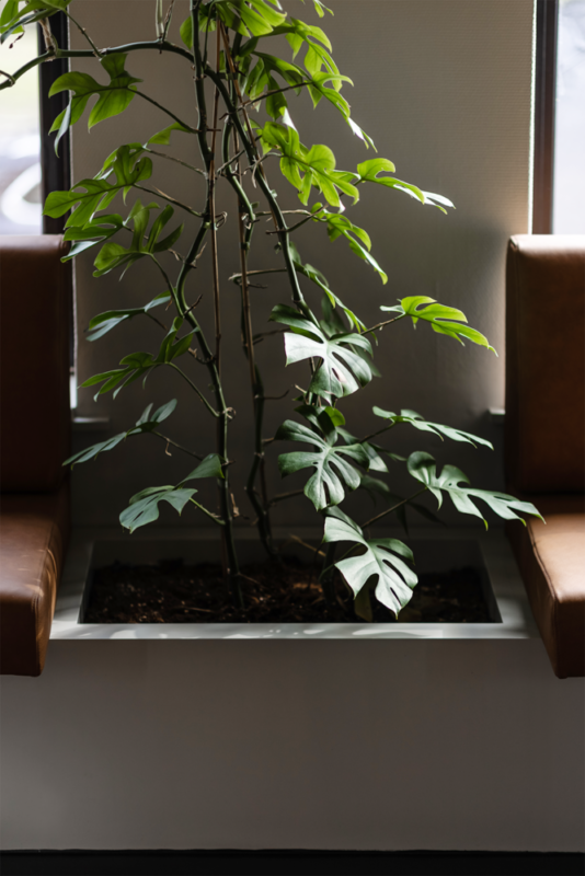
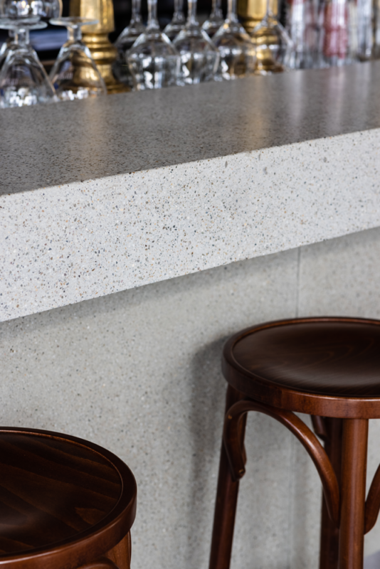
It’s a fine line to walk, reaching a grand style café that has both a warm and a modern contemporary feel. Sophisticated warm materials like sanded concrete in different hues of green, walnut veneer and custom made brass objects are mixed with huge robust concrete surfaces. Vintage style chairs, barstools, custom made mirrors and typical cafe lighting lift up the grey tones shedding a cosy atmosphere throughout the restaurant. Custom detailing is the icing on the cake. For example the thin brass strips lining different floor materials or the floor to ceiling radiator almost acting as a cream coloured curtain.
Monumental identity
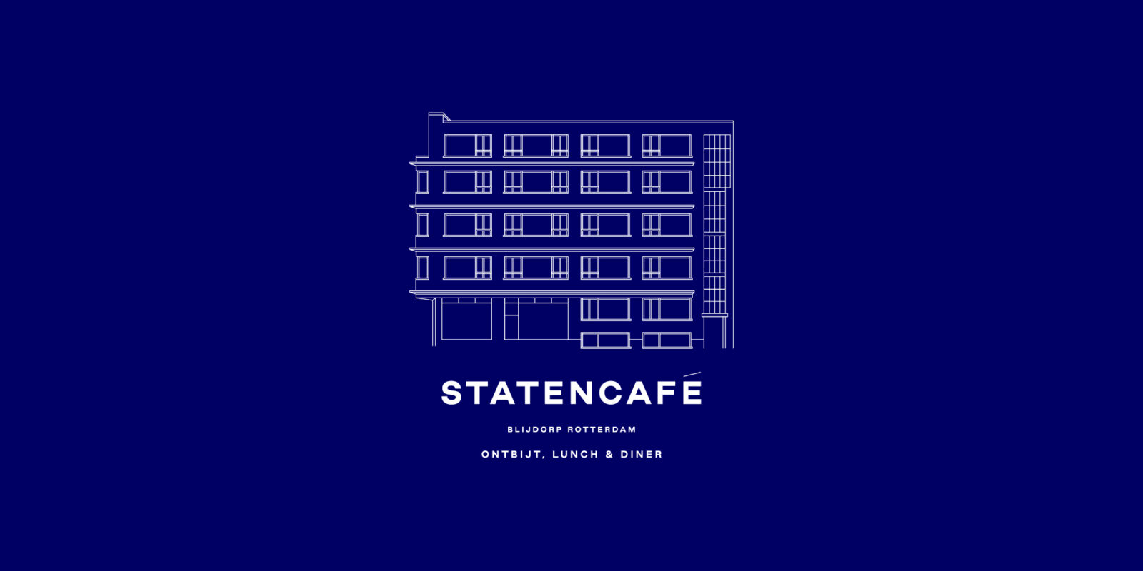
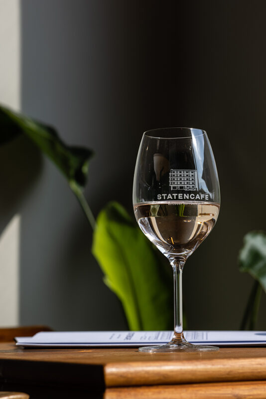
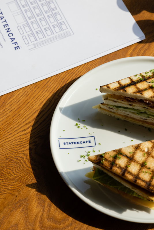
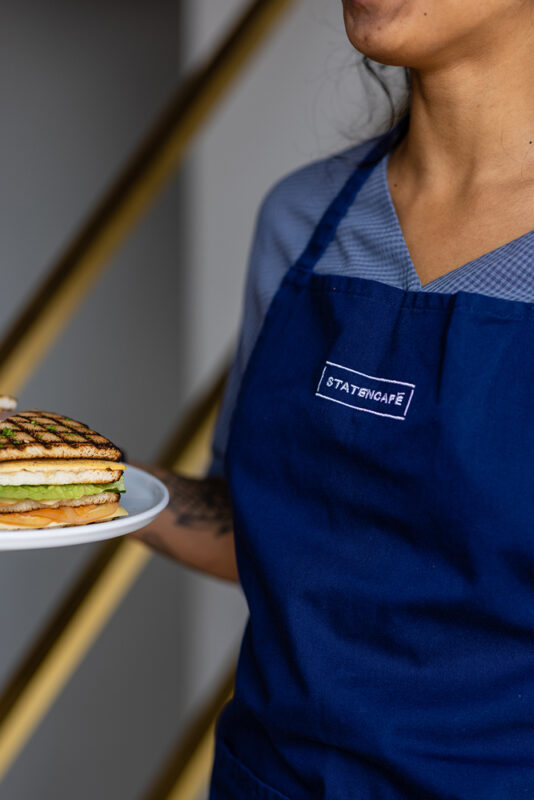
Statencafé’s building with its repetitive windowed facade lined with a vertical strip of glass marking the staircase oozes history. This exact facade is used as the primary element within the logo. Lettering and colour scheme are uncompromising and straightforward balancing out the detailed facade illustration that can be left out if necessary. A second logo is a boxed version of the primary logo that has been added for design items that can’t handle the fine detailing of the primary logo. The blue forms a powerful contrast with the warm interior and the delicious food served as the logo is depicted on menus, plates and glasses. Personnel stand out with their bright blue aprons.
A neighbourhood refuge
Rotterdam Blijdorp is a quiet part of town with only a few establishments for its residents where they can have a drink or have lunch and dinner. Before, people would go to the city centre and have a drink or bite to eat away from the neighbourhood. No more. Statencafé has become a hotspot in Blijdorp. Although the grand café is a typical neighbourhood living room, it draws people in from all over town. A place where you can just be. This refuge is a restoration of grandeur.
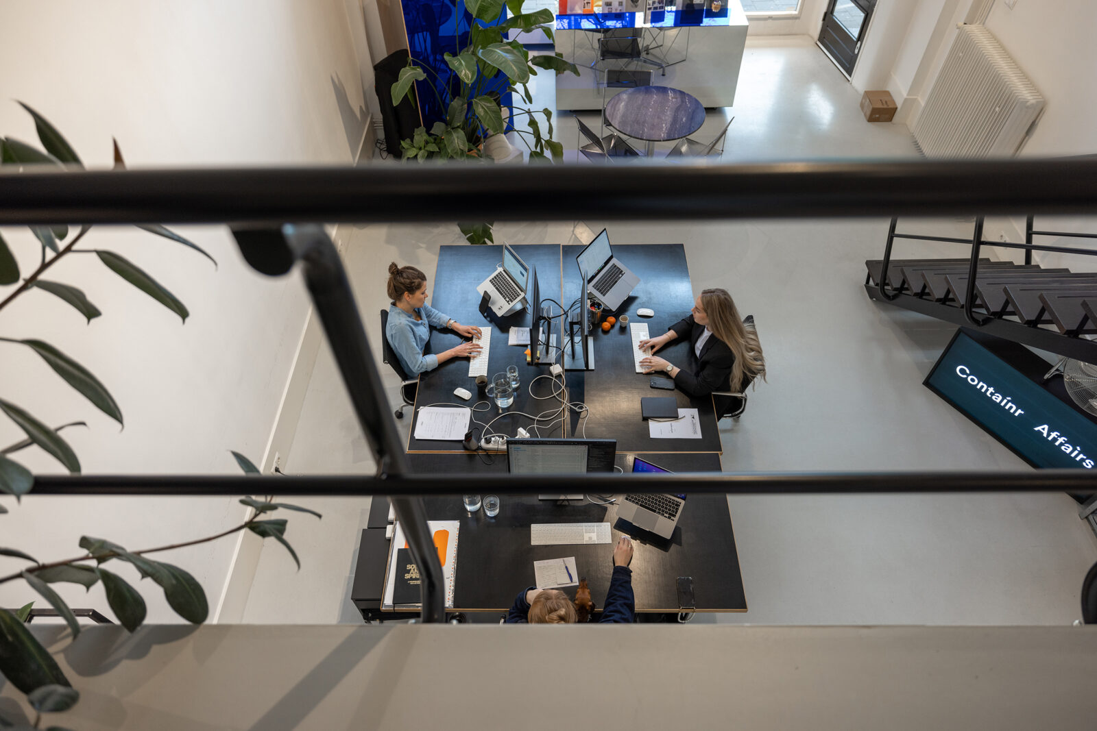
‘Together with Contaínr Affaìrs we’ve been able to create a concept, look and interior that suits the city, our wishes and the target group perfectly.’
— Wim de Klerk, co-founder Statencafe
