Van Eeghen is the oldest family business in the Netherlands whose origins date back to the 17th century where they sold spices like cinnamon to the VOC ships. We were honoured and thrilled that they commissioned us to create a completely new brand strategy. A new accompanied identity had to ensure a better representation of where the company stands today with their unique portfolio of supplements they offer to top nutrition companies worldwide.
Ratio and Emotion
The main goal was to help the brand transition from a respectable trader to a modern knowledgeable distributor. Whilst collaborating closely with the team on the company dna, we noticed such energy and enthusiasm that it became essential to encapsulate this into the new identity. We searched for a pleasant tension between ratio and emotion, thoughtfulness and playfulness; a friction where energy is created.
Wordmark creation
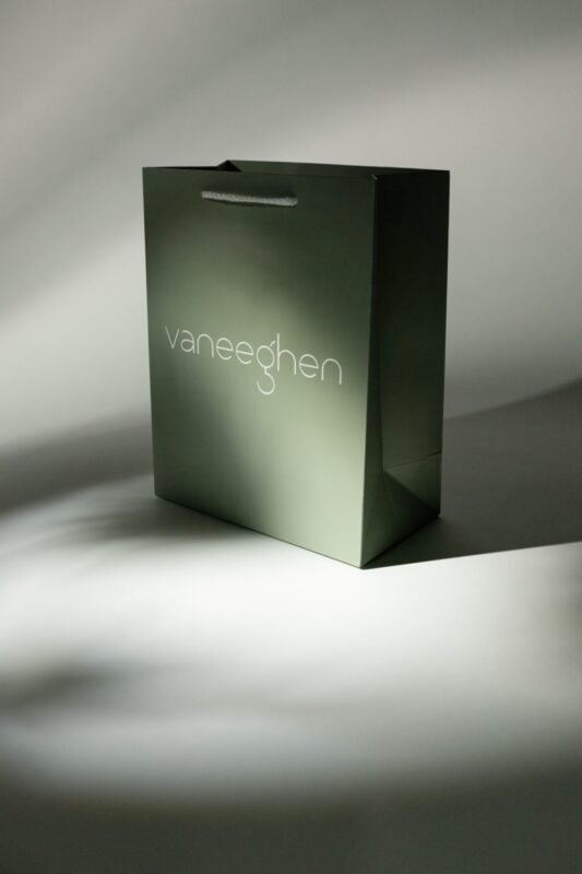
That is how the logo came to life. We created a custom typeface out of a circular ‘molecule-like’ grid and chose to connect the two separate words in ‘van Eeghen’ together for better international readability. The end result: a contemporary logo with classic touches.
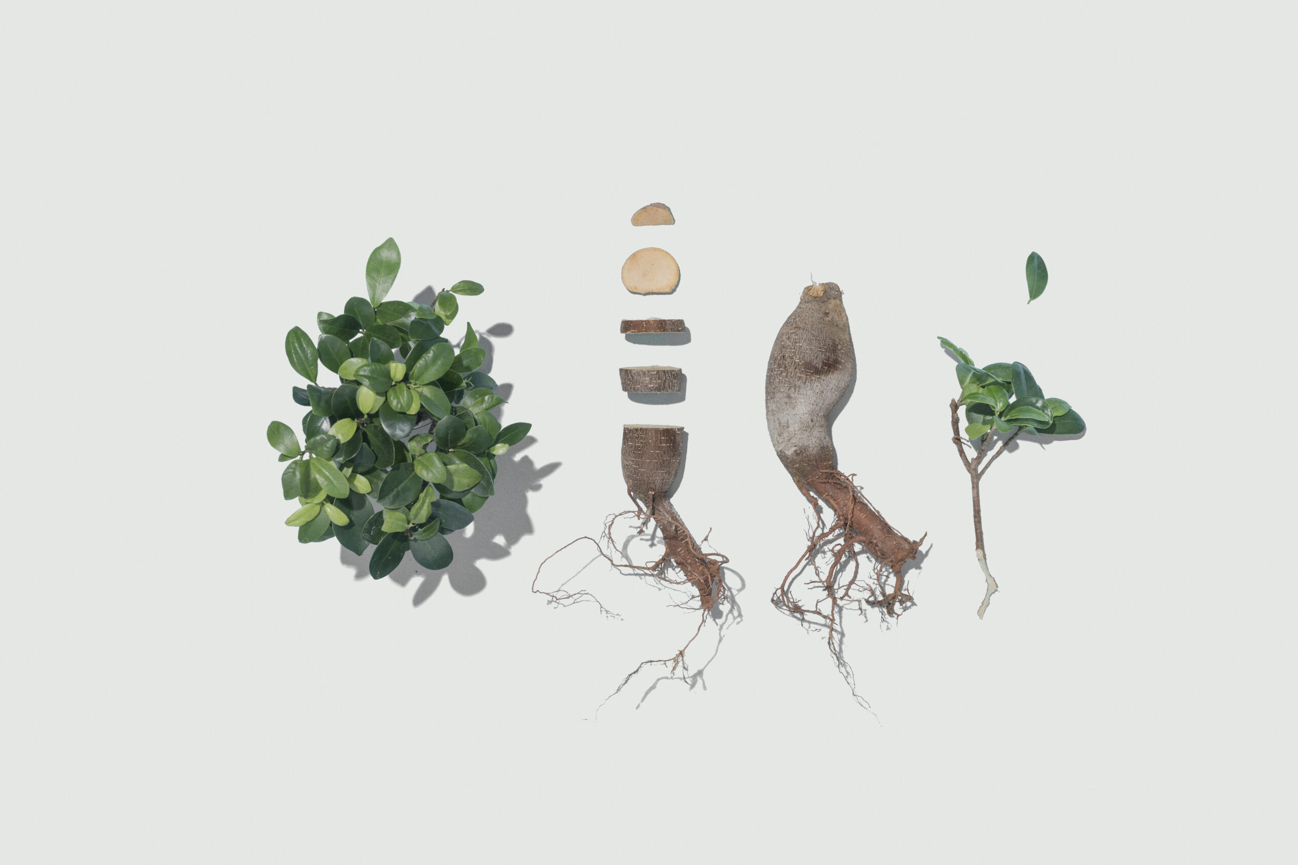
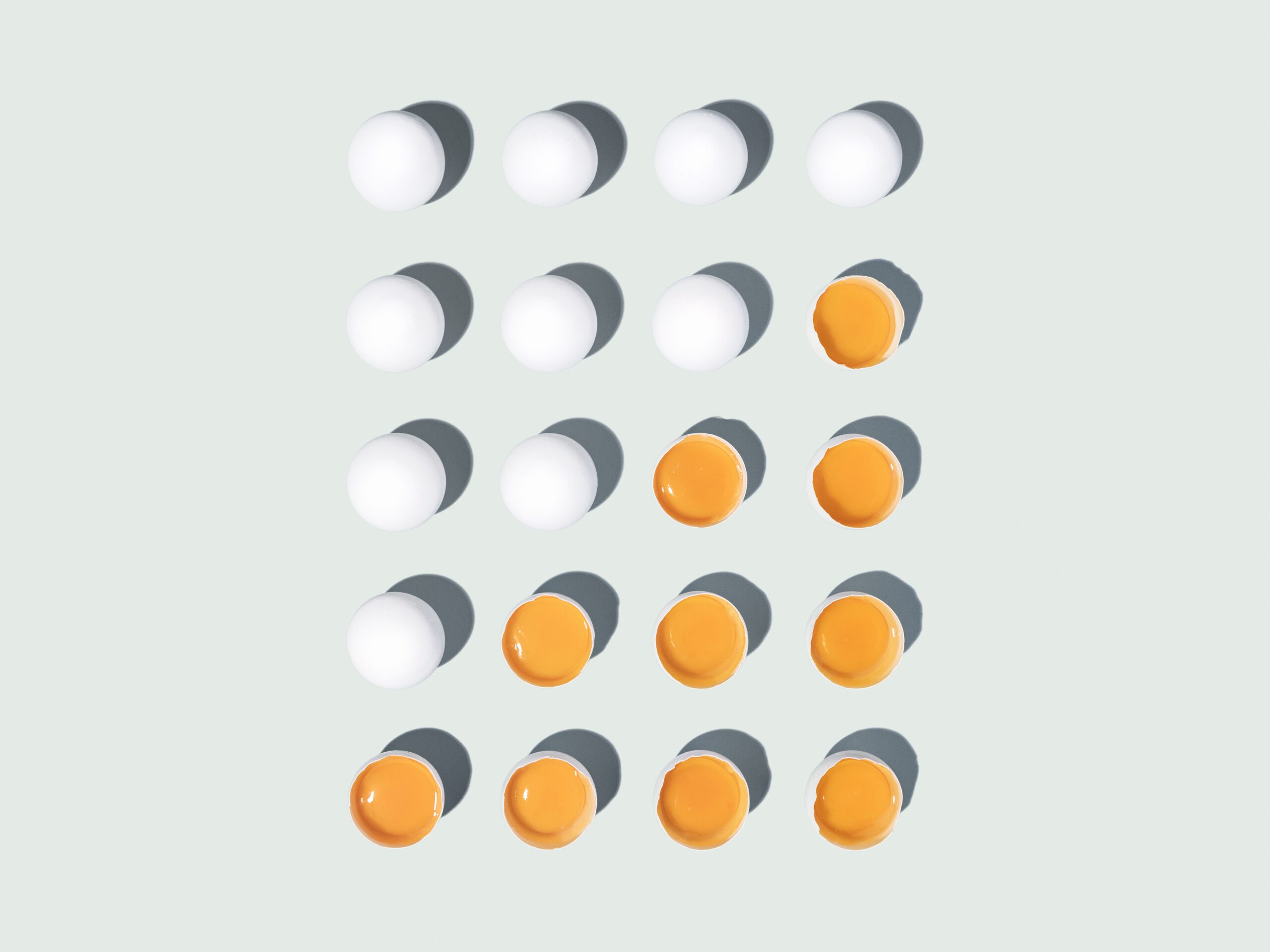
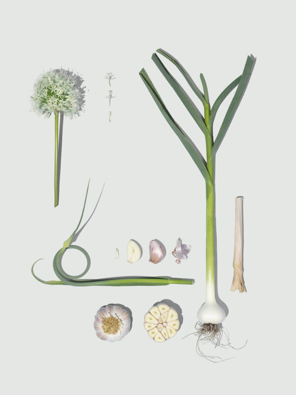
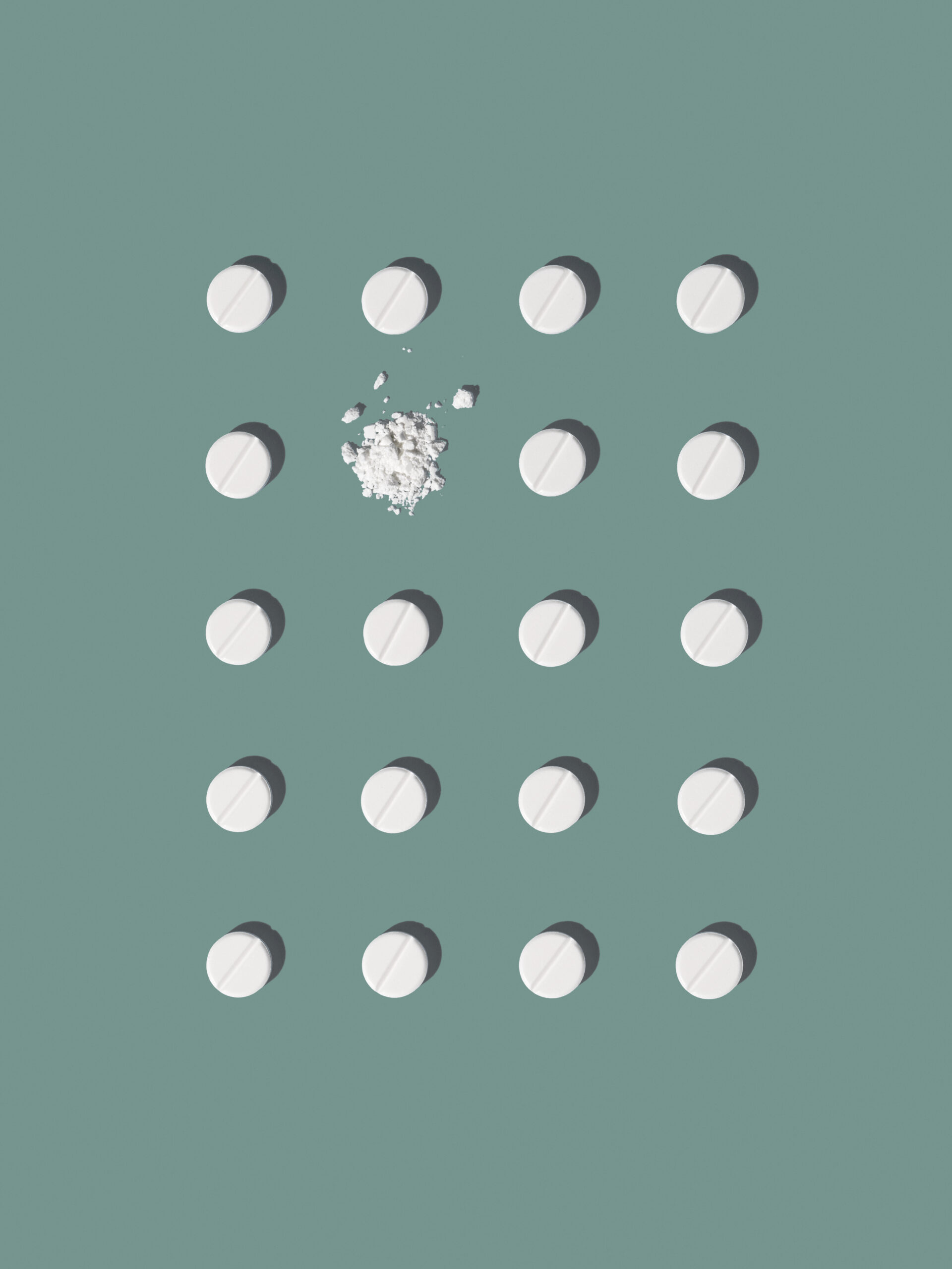
Order is the shape upon which beauty depends
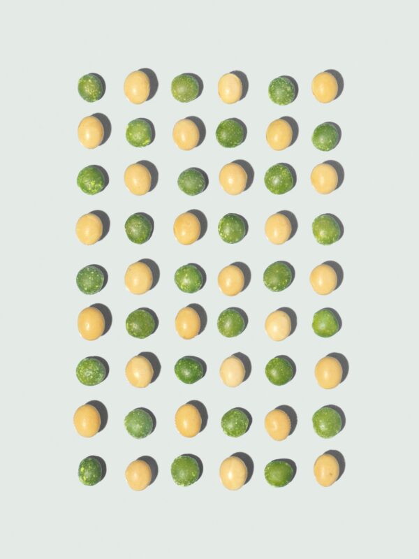
With that quote in mind we translated both their historical values and sense of innovation into an entirely new visual language. We came up with the visual concept of encyclopaedias. As a result, we were able to show off a huge amount of products in a clear and comprehensive manner as well as demonstrating how knowledgeable Van Eeghen is without boasting.
Modern Encyclopaedia
Like a modern encyclopaedia, simple, elegant and stripped down to its function, the website design was above all – moldable and thus translatable into print. The vivid shades of green were inspired by the beautiful old printed ones. To underline the playfulness of the brand, we chose a vibrant and warm dash of orange.
‘Containr thoroughly understood our DNA and translated this into a next level brand identity.’
— Jeroen van Eeghen CEO vaneeghen


)
)
)
)
)
)
)